Pure CSS Line Clamp Toggle
I’m currently working on a frontend project at work currently that involves building out a library of Twig components for a large website running on Drupal.
The mobile designs for the component I’m working on today require that if the description field has more than one paragraph, only the first 2 lines of the first paragraph should be displayed along with a basic toggle switch so a user can read more if they want.
There are multiple ways to approach this. In the past when I’ve needed this kind of expand/collapse functionality I’ve used javascript to add/remove some class that controls what elements are or aren’t shown.
This time I wanted to come up with a pure CSS solution which turned out to be a fun little problem to work on.
I like to prototype problems like this in isolation so I don’t get distracted by the surrounding code, so I used Codepen to iterate through 3 versions to get to a solution that works across all major browsers.
TL;DR⌗
Line Clamping
In order to show only the first 2 lines of the first paragraph I knew I could use the -webkit-line-clamp property. It is still an experimental feature but is supported to varying degrees in all major browsers except IE.
Checkbox Toggle
After googling for some inspiration I found it’s possible to hack a checkbox for toggle functionality. Checkboxes have state built in, and it can be accessed with the :checked psuedo-selector. The ::after psuedo-element is used to replace the checkbox with what will appear like a “Read More” link.
v1⌗
First things first, I set up the DOM starting with an .outter div that contains everything else.
Within that are 2 elements:
- The checkbox input that will be the toggle switch
- An
.innerdiv that wraps the content (a series of paragraphs).
The order these elements appear in the DOM is important because the “magic” that makes the switch work relies on the ~ sibling selector, and that can only be used to select siblings that follow the first element.
Flexbox can be used to reverse the order of the elements visually:
.outter {
  width: 400px;
  display: flex;
  flex-direction: column-reverse;
}
Next I set up the default state for the inner container:
.inner {
  display: -webkit-box;
  -webkit-box-orient: vertical;
  -webkit-line-clamp: 2;
  overflow: hidden;
}
I styled the switch so the checkbox would be hidden and instead it would appear like link that says “Read More”:
.switch {
  width: 0;
  height: 0;
}

.switch::after {
  white-space: nowrap;
  content: "Read More";
  display: block;
}

.switch:hover {
  cursor: pointer;
  text-decoration: underline;
}
And finally, I added the “checked” state which updates the switch’s text to “Read Less” and removes line clamping on the inner container so that all of the content is shown.
.switch:checked::after {
  content: "Read Less";
}

.switch:checked ~ .inner {
  -webkit-line-clamp: unset;
}
It worked beautifully! 👏 … in Chrome only.. 😞
Chrome:

Firefox:
Safari:
v2⌗
There were a couple issues to work through:
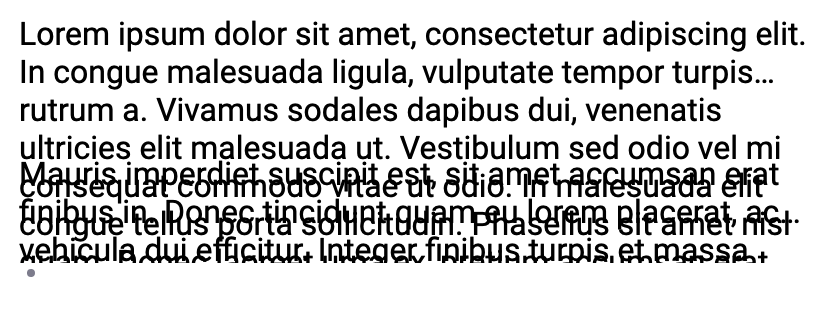
- In Firefox and Safari, the line clamping clearly wasn’t working as expected. There were a lot more than 2 lines showing and the paragraphs were rendering on top of each other.
- The switch itself rendered inconsistently across all 3 browsers. In Firefox the “Read More” wasn’t visible at all, and in Safari the checkbox was still visible.
I had used line clamping before directly on an element containing the text, but in this case I needed to truncate multiple paragraphs because that’s what Drupal would be passing to my component.
To solve for this, I moved the clamping styles from .inner to the paragraphs contained within it, and hid all but the first paragraph by default.
.inner p {
  display: -webkit-box;
  -webkit-box-orient: vertical;
  -webkit-line-clamp: 2;
  overflow: hidden;
}

.inner p:not(:first-child) {
  display: none;
}
I also added a new rule to the switch to do the reverse: display all paragraphs in the expanded state.
.switch:checked ~ .inner p {
  display: block;
}
✅ Problem 1 is solved!
Firefox:

Safari:
v3⌗
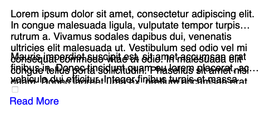
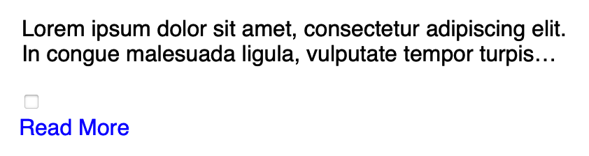
At this point all that remained was fixing the styling of the toggle switch itself so it would render consistently.
In Firefox all I was seeing was a tiny dot because I had set the width and height to 0. And in Safari, the checkbox was still showing.
The fix for these issues was a combination of setting appearance: none and visibility: hidden. (Which also meant I needed to set visibility: visible on the ::after part).
Final Solution⌗
<!DOCTYPE html>
<html lang="en">
<head>
<meta charset="UTF-8">
<meta name="viewport" content="width=device-width, initial-scale=1.0">
<meta http-equiv="X-UA-Compatible" content="ie=edge">
<link href="./line-clamp-toggle.css" rel="stylesheet" />
</head>
<body>
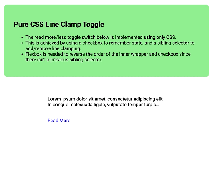
<section class="intro">
<h1>Pure CSS Line Clamp Toggle</h1>
<ul>
<li>The read more/less toggle switch below is implemented using only CSS.</li>
<li>This is achieved by using a checkbox to remember state, and a sibling selector to add/remove line clamping.</li>
<li>Flexbox is needed to reverse the order of the inner wrapper and checkbox since there isn't a previous sibling selector.</li>
</ul>
</section>
<div class="outter">
<input type="checkbox" class="switch">
<div class="inner">
<p>Lorem ipsum dolor sit amet, consectetur adipiscing elit. In congue malesuada ligula, vulputate tempor turpis rutrum a. Vivamus sodales dapibus dui, venenatis ultricies elit malesuada ut. Vestibulum sed odio vel mi consequat commodo vitae ut odio. In malesuada elit congue tellus porta sollicitudin. Phasellus sit amet nisl quam. Donec laoreet urna ex, pretium accumsan erat finibus vitae. Aliquam placerat arcu ut nunc tincidunt facilisis. Curabitur in ornare nibh. Suspendisse sit amet venenatis dolor.</p>
<p>Mauris imperdiet suscipit est, sit amet accumsan erat finibus in. Donec tincidunt quam eu lorem placerat, ac vehicula dui efficitur. Integer finibus turpis et massa volutpat, sit amet gravida elit hendrerit. Aenean egestas neque eu diam sagittis efficitur. Suspendisse imperdiet finibus turpis sit amet sollicitudin. Donec dignissim lorem tortor, et faucibus metus laoreet ut. Phasellus lectus diam, luctus vel est semper, sollicitudin pretium felis. Nullam lobortis congue sapien ac placerat. Quisque pellentesque fringilla leo quis ultricies.</p>
</div>
</div>
</body>
</html>
/**********************************************
 * Main
 *********************************************/
 .outter {
  width: 400px;
  display: flex;
  flex-direction: column-reverse;
}

.inner p {
  display: -webkit-box;
  -webkit-box-orient: vertical;
  -webkit-line-clamp: 2;
  overflow: hidden;
}

.inner p:not(:first-child) {
  display: none;
}

.switch {
  appearance: none;
  visibility: hidden;
}

.switch::after {
  visibility: visible;
  white-space: nowrap;
  content: "Read More";
  display: block;
}

.switch:hover {
  cursor: pointer;
  text-decoration: underline;
}

.switch:checked::after {
  content: "Read Less";
}

.switch:checked ~ .inner {
  -webkit-line-clamp: unset;
}

.switch:checked ~ .inner p {
  display: block;
}

/**********************************************
 * Page Styles
 *********************************************/
body,
.switch {
  font-family: Roboto, 'Open Sans', Helvetica, Arial, sans-serif;
}

.intro {
  background-color: lightgreen;
  margin: 50px auto;
  padding: 2rem;
  max-width: 60%;
  border-radius: 10px;
}

.outter {
  margin: 0 auto 100px;
}

.switch::after {
  font-size: 1rem;
  margin-top: 1rem;
  margin-left: -4px;
  color: blue;
}